
Using the TIBERIUS Responsive Theme Framework
The TIBERIUS Responsive Theme Framework Concept
If you build sites with WordPress, you have probably found that every theme has at least one annoying limitation: maybe it doesn’t have enough widgets, the menus are all wrong or the layout options are missing that one thing you need. You have to search for countless hours for a theme that comes close to your requirements and then make changes to the theme files to get it to work the way you want.
TIBERIUS is a WordPress theme framework targeted for web developers and website designers who use WordPress as a development framework to build multiple websites. Everything about the site is configurable through an innovative drag-and-drop interface, from the number and position of sidebar widget areas to the sequence and behavior of post meta data.
While the TIBERIUS Theme Framework works great out-of-the-box with its mobile-friendly responsive design and professional type and layout styles, what sets it apart is the option framework that can generate thousands of unique layout configurations without touching a single template file. These options can be exported and imported to any other WordPress site using the TIBERIUS Responsive Theme Framework.
Important: Please read the documentation before attempting to modify any settings under Appearance > Theme Options. A basic understanding of WordPress, CSS classes and HTML is required for customizing The TIBERIUS Theme Framework. Need more help?
Basic Installation
- Unzip the tiberius.zip archive
- Upload the tiberius folder to your WordPress themes directory.
- Log in to the WordPress Admin and do the following:
- Under
Appearance > Themes, activate the TIBERIUS theme. - Under
Appearance > Header, upload a header image and save. - Under
Settings > General, enter a “Title” and “Tagline” for your site.
- Under
This will enable the default settings and will have all the features for a basic site, including a header menu and the default sidebar widgets.
Adding Menus
The TIBERIUS Theme Framework includes three menu areas by default. You can add as many as you wish using the “Theme Options,” but start with the “Top Menu,” “Main Nav” and “Footer Menu” to begin.
- Create Navigation Menus using the controls under
Appearance > Menus, set up the menus you would like to use for your site. See WordPress Menu User Guide as a reference. - Apply menus to the existing menu locations using the “Locations” tab (3.6) or “Menu Areas” (earlier).
- By default, the TIBERIUS Theme Framework generates the Main Nav menu automatically using the existing pages. You can override this with your own menu by applying one to the “Main Nav” menu location.
- The “Top Menu” and “Footer Menu” use the “Inline” menu behavior by default. See Special Menu Features for ways to customize this behavior.
You can add, remove, rearrange and restyle as many Menu Areas as you need. Important: Please read through the documention thoroughly before unleashing the power of TIBERIUS!
Adding Widgets
The TIBERIUS Theme Framework installs six Widget areas by default. If this is a fresh installation of WordPress, the “Sidebar” Widget area may automatically be populated with a number of default widgets. The other five Widget Areas will be empty, and will not show on the site until you configure them. See WordPress Widgets for more information.
- Navigate to “Appearance > Widgets” in the WordPress admin.
- Add or remove widgets to the six Widget Areas by dragging and dropping the Widget icons.
- Disclaimer Left and Right – These areas are intended to be used for disclaimer text, copyright and other information. You can use Textwidgets for this purpose. By default they appear at the very bottom of the page, aligned left and right, respectively.
- Colophon Left, Center and Right – These areas are for general-purpose widgets such as categories, links, archives, recent posts or whatever. By default they form three equal columns below the main content area.
- Sidebar – This area is also for general-purpose widgets such as categories, links, archives, recent posts or whatever. By default it appears to the right of the main content area.
You can add, remove, rearrange and restyle as many Widget Areas as you need. Important: Please read through the documention thoroughly before unleashing the power of TIBERIUS!
Child Theme and Stylesheets
The TIBERIUS Theme Framework comes with a Child Theme sample that includes a stylesheet containing the most commonly edited styles (colors, type, etc.). Important: The TIBERIUS Theme Framework uses the style.css stylesheet to control all aspects of appearance. Editing style.css in the parent theme directly is not recommended because it will be overwritten when you upgrade.
Using Child Themes
WordPress will automatically include templates, styles and functions from a child theme and use the parent theme as a fallback. This allows all aspects of the theme to be customized for each site using the TIBERIUS Theme Framework. Important: For WordPress to import TIBERIUS as a framework, style.css must exist in the child theme folder and must contain the following:
/*
 * Theme Name: Tiberius Child
 * Template: tiberius
 */
@import url(../tiberius/style.css);
You can find more information about Child Themes in the WordPress.org Codex.
To use the Child theme, do the following:
- Edit
style.cssandfunctions.phpto override the default functionality as desired. - Add any additional custom templates.
- Upload the
tiberius-childfolder to your WordPressthemesdirectory. - Log in to the WordPress Admin
- Under
Appearance > Themes, activate the “Tiberius Child” theme.
Theme Options
With the Theme Options, you can:
- Assign layouts to the WordPress Default Templates
- Add and remove rows from layout sections
- Configure wrappers for sections and rows
- Add layout items and arrange them on the page
- Add, remove and configure Widget Areas, Nav Menus, Post Loop Areas and Template Parts
- Fine-tune sequence and position of all dynamic elements
- Specify IDs and CSS classes for sections, rows and layout items
- Configure The Loop to display specific elements in any order
Global Settings
Max Content Width
This setting is a requirement for all themes. It specifies the maximum width for any media file (image, video, etc.) so that it does not extend beyond the boundaries of the page layout. Important: Max Content Width DOES NOT control the width of the page or layout sections, only the width of media elements.
Wrap header and/or footer with layout
These options determine if a main wrapper is used, and how that wrapper encloses the three main sections of the page. If one or the other is checked, the main wrapper will enclose those two sections and render the third outside of the wrapper. If both are checked, all three sections will be enclosed in the main wrapper. The purpose of the main wrapper is to provide a way to assign CSS classes to large sections of the layout.
Wrapper Classes
If the main wrapper is being used, you can specify classes for it by entering them in this input box.
Section Settings
These settings apply to each of main sections: header, footer and the five layouts independently.
Wrap Section
If you want to be able to control the styles of all rows in a section with a single group of classes, check this box. TIBERIUS will wrap the section in a div whose ID is the name of the section, e.g., “header,” “layout1”, “footer,” etc.
Section Classes
If the section wrapper is being used, you can specify classes for it by entering them in this input box.
Templates that use this Layout:
You decide which layout to use for each of the Default Templates by dragging the template icon to area labeled “Templates that use this layout” in the layout section desired.
All templates are mapped to Layout1 by default. See Default Templates for more information.
Row Settings
Adding and Removing Rows
New rows can be added to a section by clicking the “plus” icon in the upper right corner. TIBERIUS has the option for multiple rows so that regions can be styled independently of each other. Click the “trash” icon to delete a row.
Arranging Rows
You can drag and drop rows to reorder them in a section, or drag them into other sections.
Flush
This option adds the “flush” class so that cells widths are calculated without margins, and no margins are applied. This is useful if your layout depends on backgrounds to be flush with each other.
Balance
This option adds the “balance” class that will trigger a jQuery function to automatically set all of the row’s cells to the same height. This is useful if the row consists of relatively equal sections on content (such as widgets) so that they appear even on the page. It can also be used to adjust sidebars to match the height of the accompanying Post Loop area.
Outer Wrap Rows
This option adds an outer div wrapper to contain each row.
Outer Classes
If the outer wrapper is being used, you can specify classes for it by entering them in this input box.
Inner Classes
You can specify classes for the inner row wrapper, which is always present, by entering them in this input box.
Layout Items
Adding and Removing Layout Items
New Layout Items can be added to a section by dragging one of the dashed-border squares from the “Layout Items” panel to one of the layout rows in the main layout area. Each Layout Item has different options depending on type. Click the “trash” icon to delete a Layout Item.
Arranging Layout Items
You can drag and drop Layout Items to reorder them in a Row, or drag them into other rows, even in other sections.
Settings Common To All Layout Items
Cells must use a specific set of CSS attributes for TIBERIUS to render pages correctly. For this reason, only certain style attributes can be modified in the Theme Options.
ID
You can specify the ID of each layout item so that it can be selected individually by CSS or jQuery. Important: the ID must be unique to the page.
Top Margin
Select from the various top-margin options to fine-tune your layout.
End
This option removes the default right-margin from the cell. Use this on cells that appear at the end of a row.
Right
This option floats the cell right. Set the “end” option to remove the default right margin.
Clear
This option applys a float clearing rule to the cell, thereby starting a new row.
Flat
This option removes the default bottom margin from the cell so it appears flush with items below it.
Width
Select from the various width options. TIBERIUS defines these widths as fractions, e.g., three equal cells would use the style width-1-3. The only rule is that all the fractional widths in a single row must add up to exactly 1.
Custom
There may be times when the default cell behaviors cannot accomplish the design you want. In these cases, you can use the custom setting to override the standard cell options and add your specific classes. The layout item will turn yellow and span the entire width of the layout in the theme options display area to designate it as a custom cell. Important: Using custom styles on layout items may have unexpected results. By overriding the default behavior, TIBERIUS renders the content using the stylesheet alone. Use custom CSS with care.
Copy From…
Certain Layout Items can reuse settings from existing Layout items of the same type by selecting them from this menu.
Please read Cells: The Fluid Grid Evolves for more information about these settings.
Header Image
This Layout Item uses the native WordPress theme support for custom headers. It is adds a cell that includes the custom-header.php template part. You can upload, select and crop the header image using the “Appearance > Header” options in the WordPress Admin.
Site Title
This Layout item adds a cell that contains the Site Title configured under “Settings > General” in the WordPress Admin. The Site Title is inserted inside a h1 tag with the site-title class.
Tagline
This Layout item adds a cell that contains the Tagline configured under “Settings > General” in the WordPress Admin. The Tagline is inserted inside a h2 tag with the site-tagline class.
Template Part
This Layout Item adds a cell that includes any Template Part you specify. Click “Edit Template Part Options” to reveal a panel where you can enter the Part Name and Extension. For example, if the Template Part is mypart-myextension.php, you would enter “mypart” in the “Part Name” field and “myextension” in the “Extension” field.
The Extension field is optional, so if you wanted to include the searchform.php Template Part you could just enter “searchform” in the “Part Name” field and leave the “Extension” field blank. This will result in a search box appearing in the Layout Item cell.
You can find more information about Template Parts in the WordPress.org Codex.
Sidebar
This Layout Item adds a cell that includes any Sidebar you specify. Click “Edit Sidebar Options” to reveal a panel where you can enter the Sidebar Extension. For example, if the Sidebar is sidebar-home.php, you would enter “home” in the “Extension” field.
The Sidebar Layout Item is identical to the Template Part Layout Item, except that it automatically includes templates with “sidebar” in their name. This feature is included for consistency, so that you can continue to use WordPress like you would for any other theme.
Important: Do not confuse the Sidebar Layout Item with the Widget Area Layout Item, which inserts a Dynamic Sidebar object, not a Template File.
You can find more information about Sidebars in the WordPress.org Codex.
Now that you can set up unlimited Widget Areas, you really don’t need to use sidebars any more. Even so, sidebars and template parts still work fine, and you can either include them the old way, inside the template itself, or the TIBERIUS way, using the Theme Options.
Widget Area
The terms “Dynamic Sidebar” and “Widget Area” mean exactly the same thing. Important: Do not confuse the Widget Area Layout Item (or “Dynamic Sidebar”) with the Sidebar Layout Item, which inserts a Template File not a Dynamic Sidebar.
This Layout Item performs two functions. First, it configures a new Dynamic Sidebar for your theme that will then appear under “Appearance > Widgets” in the WordPress Admin. Second, it adds a cell that contains the Widget Area in the layout. Click “Edit Widget Area Options” to reveal a panel where you can enter the following settings to be applied to this Widget Area:
- Area Name Enter this Widget Area’s Name. This will then appear above the Widget Area in the “Appearance > Widgets” WordPress Admin page.
- Description Enter this Widget Area’s Description. This will appear above the Widget Area in the “Appearance > Widgets” WordPress Admin page.
- Before Widget Enter the HTML code to appear before any Widget on the rendered page. This is where you can specify the container and CSS classes for the Widget. Example:
<div class="mywidget"> - After Widget Enter the HTML code to appear after any Widget on the rendered page. Example:
</div> - Before Title Enter the HTML code to appear before any Widget’s Title on the rendered page. This is where you can specify the container and CSS classes for the Title. Example:
<h3 class="mywidget-title"> - After Title Enter the HTML code to appear after any Widget’s Title on the rendered page. Example:
</h3>
The Widget Area Layout Item Settings panel includes a select menu containing all of the other Widget Areas in your Theme Options that appears below the “Edit Widget Area Settings” link. If you want to use an existing Widget Area in this cell, you can select it from the menu and TIBERIUS will automatically reuse the settings from that Widget Area.
Once a Widget Area is configured in the Theme Options, you can add Widgets to it from the “Appearance > Widgets” WordPress Admin page.
Menu Area
This layout item performs two functions. First, it configures a new Nav Menu Location for your theme that will then appear under “Appearance > Menus > Manage Locations” in the WordPress Admin. Second, it adds a cell that contains the Menu Area in the layout. Click “Edit Menu Area Options” to reveal a panel where you can enter the following settings to be applied to this Menu Area:
- Area Name Enter this Menu Area’s Name. This will then appear as an option “Appearance > Menus” WordPress Admin page.
- Default to Page Menu By default, Nav Menu Areas will only display if they are mapped to a specific Menu from the “Appearance > Menus” WordPress Admin page. Select this option if you want this menu to automatically populate with links to all of the existing pages. TIBERIUS will also add a link to the Home page when this option is used.
- Menu Class You can specify CSS classes to apply to this Menu Area’s container. Example:
inline-menu
The Menu Area Layout Item Settings panel includes a select menu containing all of the other Menu Areas in your Theme Options that appears below the “Edit Menu Area Settings” link. If you want to use an existing Menu Area in this cell, you can select it from the menu and TIBERIUS will automatically reuse the settings from that Menu Area.
Once a Menu Area is configured in the Theme Options, you can map it to a Nav Menu from the “Appearance > Menus” WordPress Admin page.
Special Menu Features
If you specify “main_nav” as the ID for a Menu Area Layout Item in the cell settings, TIBERIUS will use it as the Mobile Menu Panel automatically. See “Mobile Menu Panel,” below, for more information.
You can control the appearance and behavior of Menu Areas by applying one of the following classes:
- inline-menu The menu will display in a single line, separated by a vertical line. Sub-menu items are displayed on the same line with their parents, so this option is best used with short menus.
- context-menu The top-level menu displays as a row of boxes. Sub-menus appear on hover relative to thier parent menu items.
- horz-menu The top-level menu displays as a row of boxes. Sub-menus appear on hover in a single row below their parent menu items.
You can add your own menu behavior in a child theme in addition the pre-configured menu classes and apply them in the Menu Class field.
Post Loop Area
The ability to manage the behavior of The Loop inside Posts and Pages is probably the most powerful feature of the TIBERIUS Theme Framework. Instead of writing custom code inside numerous template files to control the way your pages render content, you can fine-tune all aspects of the content inside the Theme Options.
Additionally, most of the content elements are rendered from Template Part files that can be edited individually if you need that level of fine-tuning.
There are also advanced settings that apply to Custom Post Types so that you can design your theme to display content like image galleries, portfolios and video libraries.
We have designed TIBERIUS to use as much native WordPress functionality as possible so that if you want to bypass the theme framework functionality and use your own, it will still work as expected.
The Post Loop Area Layout Item adds a cell that contains options to control the display. Every Post Loop Area has settings for single and multiple posts. The settings that are used depend on the context of the page that is loaded. Within each option section there are settings that apply inside and outside The Loop. You can find more information about The Loop on the WordPress.org Codex.
Each element can be re-ordered by dragging and dropping them inside the Post Loop Area Settings panel. If you do not want to include an element, deselect its box and it will display as “grayed out” in the options panel. Required elements do not have a check box.
- Single: These settings are used when WordPress determines a single post should be displayed. The Page, Single and Image Default Templates always use the single settings.
- Breadcrumb Links: This will display a hierarchical representation of the current page with links to all parent pages. Breadcrumb behavior can be fine-tuned by overriding the
tiberius_breadcrumb_linksfunction in a child theme. - The Loop: For single post pages, The Loop iterates only once.
- Entry Wrapper: The Entry Wrap Start and Entry Wrap End elements determine where the open and close tags fall for the
post-entry divcontainer. Drag these elements before and after the Loop elements you want wrapped together as thepost-entry. - Title: You can fine-tune the behavior by editing the
loop-title.phptemplate file. - Featured Image: You can select the image size from the menu. Position is controlled by the stylesheet, so you can adjust the behavior by placing this element inside or outside of the Entry Wrapper element and modify the corresponding styles. You can fine-tune the behavior by editing the
loop-thumbnail.phptemplate file. - Post Meta: This will display the date, author and number of comments with links to each. You can fine-tune the behavior by editing the
loop-postmeta.phptemplate file. - Content: The content will behave according to your main WordPress settings.
- Taxonomy Links: This will display links to any associated taxonomies for the post type (defaults are categories and post-tags). You can fine-tune the behavior by editing the
loop-taxlinks.phptemplate file. - Multi-page Links: WordPress automatically builds links to additional pages when you break the content using the
<!--nextpage-->code. - Excerpt: There may be cases where you wish to use the post excerpt instead of the full content. You can fine-tune the behavior of excerpts with the Advanced Options, below.
- Author Bio This will display the post author’s avatar, link and description text if it exists. You can fine-tune the behavior by editing the
loop-authormeta.phptemplate file. - Prev-next: This will display links to the previous and next post chronologically. You can fine-tune the behavior by editing the
loop-prevnext.phptemplate file. - Comments: This will display user-submitted comment threads if you have comments enabled for this page or post. Note: the comments.php is required for all themes, whether or not you have comments enabled. You can customize the way comments are navigated using following options:
- Prev-next: This displays links to the previous or next page of comments one at a time.
- Page Links: This displays additional pages of comments as a row of links.
You can fine-tune the behavior by editing the
comments.phptemplate file. - Comment Form: The form is not optional, but you can reorder its position in the layout. You can fine-tune the behavior by editing the
comments-form.phptemplate file. - Pings/Trackbacks: When this item is selected, TIBERIUS separates comments from pingbacks and trackbacks. Note that all pings will be displayed in this item section, while regular comments will be separated into pages based on your discussion settings. You can fine-tune the behavior (such as commenting out pings entirely) by editing the
comments-pings.phptemplate file. When not selected, pingbacks and trackbacks are shown with the other comments if configured to do so. - Hide Pings Check this box to hide all pingbacks and trackbacks from the comments. The Pings/Trackbacks setting must be enabled for this option to work.
- Entry Wrapper: The Entry Wrap Start and Entry Wrap End elements determine where the open and close tags fall for the
- Breadcrumb Links: This will display a hierarchical representation of the current page with links to all parent pages. Breadcrumb behavior can be fine-tuned by overriding the
- Multi These settings are used when WordPress determines a multiple post list should be displayed. The Archive, Home and Search Default Templates always use the multi settings.
- Breadcrumb Links: This functions the same as in the single options, above.
- Archive Title This will display the type of post list being viewed (e.g, Category, Author, Search, etc.) You can fine-tune the behavior by editing the
content-loopheader.phptemplate file. - Archive Description If the taxonomy being displayed has a description, it will appear in this element. You can fine-tune the behavior by editing the
content-descr.phptemplate file. - Page Navigation You can include up to two optional navigation elements, one for the top and bottom of the page, if desired. You can customize the way the pages are navigated using following options:
- Prev-next: This displays links to the previous or next page of posts one at a time.
- Page Links: This displays additional pages of posts as a row of links.
You can fine-tune the behavior by editing the
content-pagenav.phptemplate file. - The Loop All of the following elements function the same as in the single options, above, except that they repeat for each iteration of The Loop.
- Entry Wrapper
- Title
- Featured image
- Post Meta
- Content
- Taxonomy Links
- Excerpt
- Excerpt Options These settings override the default
More Tagand control the length of excerpts on pages using this layout.- More Text This setting overrides the “Read More” default text that appears when WordPress displays a link after an excerpt.
- Excerpt Length This setting will override the 35-word default excerpt length.
- Advanced Options These options allow for more complex loop behaviors, such as additional Blog Pages and Custom Post Type listings.
- Convert Page to List This setting toggles the advanced list settings on or off.
- Post Type You can specify that a Layout only display posts of a Custom Post Type. The menu will automatically populate with all public-facing post types.
- Posts per Page This setting will override the posts per page setting in
Settings > Reading. - Posts in Row This setting will make The Loop subdivide the Post Loop Area by the number entered and left-float the posts. Use this option for displaying galleries of Custom Posts.
Custom Page Templates
Pages will use the Page Default Template unless otherwise specified in the settings for that page. TIBERIUS automatically includes Layouts 1-5 as Template options on the Edit Page WordPress Admin page, but you can add as many additional templates as you need by adding theme to your Child Theme(s)
For custom templates to appear in the Theme Options (including headers and footers), the same rules apply as with WordPress itself:
- Template files must contain a comment line with the text, “Template Name:,” followed by the name as you want it to appear. For example:
/* * Template Name: My New Template */ - Template file names must be unique to the theme, e.g.,
mytemplate.php - Headers must begin with “header-” followed by a unique identifier, e.g.,
header-myheader.php - Footers must begin with “footer-” followed by a unique identifier, e.g.,
footer-myfooter.php
Any custom page templates that you add in a child theme will appear in Appearance > Theme Options as well as the “Template” menu in the “Edit Page” admin page.
You can find more information about Custom Page Templates in the WordPress.org Codex.
With the TIBERIUS Theme Framework, we have moved all of the logic to the Theme Options. This means the template code can be streamlined as follows:
<?php
/*
 * Template Name: My Template
 */
get_header('myheader');
tiberius_render_section('content', 'mytemplate');
get_footer('myfooter');
?>
Custom headers can be integrated with TIBERIUS the same way:
<?php
/*
 * Template Name: My Header
 */
/* header PHP code here ... */
?>
<!doctype html>
<html><head>
<!-- header html, etc -->

<?php
tiberius_render_section('header', 'myheader');
?>
As well as custom footers:
<?php
/*
 * Template Name: My Footer
 */
tiberius_render_section('footer', 'myfooter');
wp_footer();
?>
</body>
</html>
You may have noticed that there is no get_sidebar function. With TIBERIUS, sidebars are controlled inside the Appearance > Theme Options Admin page.
Now that you can set up unlimited Widget Areas, you really don’t need to use sidebars any more. Even so, sidebars and template parts still work fine, and you can either include them the old way, inside the template itself, or the TIBERIUS way, using the Theme Options.
Custom Post Types
You can add Custom Post Types to the TIBERIUS Theme Framework either by using a plugin or by modifying functions.php with a child Theme. When a publicly queryable Custom Post Type is detected, TIBERIUS will automatically add two pseudo-templates to the list of Default Templates. The first is named “single-(post type)” to allow customization of single post pages, and the second is named “archive-(post type)” to allow customization of multi post pages. They are both mapped to Layout1 by default.
New publicly queryable Custom Post Types are also added to the list of post types in the Advanced Settings for Post Loop Area Layout Items. You can specify the post type, posts per page and posts in row for a Layout configured to display a Custom Post Type using the Advanced Settings.
You can find more information about Custom Post Types in the WordPress.org Codex.
Taxonomies
By default, Categories and Post Tags associated with a given post will appear in the Taxonomy Links and Breadcrumb Links if the Post Loop Area is configured to show them. TIBERIUS will automatically include any custom taxonomies to these links as well as long as they are public.
You can find more information about Custom Taxonomies in the WordPress.org Codex.
Mobile Menu Panel
When any WordPress page using the TIBERIUS Theme Framework is loaded on a device with a viewport smaller than 600px wide (running a CSS3 enabled browser) the Main Navigation (#main_nav) menu will convert to a Mobile Menu Panel with a set of mobile-friendly icons and larger type. When the user clicks the menu icon (three horizontal bars), the page freezes in place and the menu appears. By default, it functions as an overlay sliding down from the top of the page.
For the Mobile Panel Menu to appear, at least one Menu Area Layout Item must be present whose ID is main_nav.
This menu can be further enhanced by adding any of the following styles to the Menu Area Options Menu Class field:
- Overlay Effect (default): The menu panel slides over the top of the content.
- Push Effect: The menu panel slides in and moves the content out of the window, leaving a small area visible. Not compatible with origin-top
- Reveal Effect: The content slides out of the window and reveals the menu panel, leaving a small area visible. Not compatible with origin-top
- Left Origin: The menu panel slides in (or is revealed) from the left.
- Top Origin (default): The menu panel slides from the top.
- Right Origin: The menu panel slides in (or is revealed) from the right.
Important: the Mobile Menu Panel is automatically disabled in Internet Explorer 8 and below.
Import and Export
From the Theme Options, you can save your settings to your computer as a compressed archive file by clicking Export. The file will be saved as a GZip (.gz) archive. Do not rename the file or TIBERIUS will not recognize it when you try to import. (It must detect the strings “options_” and “.gz” in the filename.)
Likewise, you can import from an existing archive by using the file uploader at the bottom of the page. The selected file must contain the strings “options_” and end with the “.gz” extension.
We recommend that you export your settings before you make changes in case you get into trouble and need to revert.
This feature allows you to share, purchase or even sell your configurations for other WordPress sites. We expect to have a wide selection of preconfigured themes available for purchase in the near future, so check back often.
Appendix A: Responsive Design
Responsive design is not new (in fact, none of this is new). Back in the last century, content automatically wrapped to fit the browser window. It wasn’t until somebody got the idea to use HTML tables to create page layouts that web pages stopped being responsive. Thankfully, using tables for layouts has been banished from the design community in favor of carefully crafted cascading style sheets (CSS).
The biggest change arrived with the adoption of @media queries in CSS3. Styles can now be applied when certain conditions exist in the user’s browser, specifically maximum and minimum widths.
TIBERIUS automatically responds the the user’s device viewport in a number of ways:
- Widths are always a percentage of the viewport. Hard-coded pixel widths should only be used when absolutely necessary.
- Images have max-width of 100% of their containers so they never display wider than their parents.
- Cells are floated so they will reposition themselves naturally when the viewport is resized.
- When the viewport is smaller than the “breakpoint” (default 600 pixels), cell floats are removed so they display full-width sequentially and the main navigation converts to a smartphone-style panel menu. All other “context” and “horz” menus are hidden by default. “Inline” menus are displayed by default, but can be hidden by applying “hide” classes.
- In some cases content is hidden when the viewport is smaller than the breakpoint to reduce the amount of clutter on the page.
- Certain style attributes change with various viewport widths to accommodate the smaller screen.
These behaviors will make the site look great on just about any device. There are a few things to consider when designing your layouts for consistent fluid/responsive behavior.
When cells floats are removed, they will appear in the sequence they appear in the source code. This may cause cells (e.g., Widget Areas) to appear above the the content when you actually want them below. This can be avoided by arranging the cell to appear after the content in the Theme Options and then applying the “right” cell style to the Layout Item. This way, when the floats are removed, the cells appear in the correct order.
You can use the cell width and other cell classes on content inside a post or page. To override the default breakpoint behavior, you can apply the nobreak class to keep the floats through the breakpoint. The nobreak class should not be applied to Layout Items (the main cells in the Theme Options) as this may cause unexpected display issues.
There are a number of “show” and “hide” classes specific to each breakpoint width. See the “Stylesheet” section for a listing.
Important: the @media styles do not work in Internet Explorer 8 and below, however TIBERIUS is written to make the layout look as good as possible in these browsers.
Appendix B: Default Templates
When you load a page on a WordPress site, the program automatically chooses from a number of standard templates, depending on the context. Here is the complete list of Default Templates used by the TIBERIUS Theme Framework:
- home — template for showing list of “blog” posts
- page — template for static “pages”
- single — template for individual “posts”
- archive — template for groups of “posts”
- search — template for “posts” and “pages” matching search results
- image — template for showing “attachments” (images and other media)
- 404 — template when a page or post is not found
- index — template used when no other template is appropriate
You decide which layout to use for each of the Default Templates by dragging the template icon to any one of the five layout sections labeled “Templates that use this layout.” All are mapped to Layout1 by default.
We’ve moved all of the control logic to the Theme Options so you can spend your precious time on the thing that sets your design apart: your stylesheet. The default TIBERIUS stylesheet looks great on any browser, but you will undoubtedly want to create your own. (This can be done, as suggested, using a child theme.)
More information about Default Templates is available from the WordPress.org Codex.
Appendix C: Sections, Rows and Wrappers
TIBERIUS was designed to enable site designers to create virtually any layout. This is accomplished using sections, rows and wrappers.
TIBERIUS uses three standard sections: header, content and footer. The header and footer layouts are used globally across the site whenever the get_header() or get_footer() functions are called, respectively. The content section can contain one of five different optional layouts, each having their own configuration.
A TIBERIUS theme always consists of a header layout, a footer layout and at least one content layout (numbered 1-5). You decide which content layout to use for each of the Default Templates by dragging the template icon to its respective content layout.
Usually, a WordPress theme will wrap the entire page in one or two main containers, one for the header (sometimes the footer) and one for the rest of the page. This is constrained by a max-width style rule and centered on the page. This is fine for the vast majority of sites out there.
But we work with designers who like to throw things at us like header bars that span the entire page and do crazy things like overlap the main content. Sometimes they want the footer to stick to the bottom of the page or have their own background image (again spanning the entire page). None of this is possible with the standard “single container” approach.
The solution to this challenge is to provide the option to wrap segments of the page in their own div wrapper while maintaining the same logical control flow of a standard WordPress theme. These segments are called rows.
Each row has an inner wrapper (for centering the content) and and optional outer wrapper (for spanning the page). For consistency, these are collectively called the “row wrapper.”
Additionally, each section can be individually wrapped (thus containing all the rows in that section). Finally, the content section can be wrapped with the header, the footer or both (the now-famous “single container” we mentioned before). For consistency we will call these “section wrapper” and “main wrapper,” respectively.
With the exception of the inner row wrapper, wrappers are completely optional and can be toggled on or off at any time in the Theme Options. By default, each section has one row, and all three sections are wrapped in a single “main wrapper.”
This diagram illustrates three different approaches, the first is the default configuration. The second uses the (very) common header + content / footer configuration and the third uses different wrappers to span the page. We will describe the individual styles used on these wrappers later in this document.
-
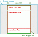
- Default configuration
-
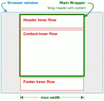
- Content + Header / Footer
-
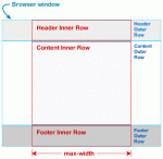
- Outer row wrappers
Appendix D: Cells: The Fluid Grid Evolves
A layout grid is simply a way to assign standard widths to layout elements so that they work together like pieces of a puzzle. We decided to use the term cell to describe these styles because it more accurately describes the behavior of the elements than grid.
By default, a cell floats left and has a standard right and bottom margin to space it away from the adjacent cells. It also has a width that is a percentage of the width of its parent container. It is important that a cell does not have any padding or border. Otherwise the total cumulative width of the cells would be greater than the sum of their percentages.
TIBERIUS defines these widths as fractions, e.g., three equal cells would use the style width-1-3. Eight equal cells would use width-1-8 and so on. Likewise, a row of five cells could consist of two cells using width-2-5 and width-3-5. TIBERIUS allows widths to be divided by 12, 10, 8, 6, 5, 4, 3 and 2 allowing for very precise layout configurations. The only rule is that all the fractional widths in a single row must add up to exactly 1.
This means, for example, you could combine width-1-6, width-1-2 and width-1-3 but not width-2-5 and width-5-8. Also note that the lowest common denominator is used in the class name. In other words, you would use width-2-5 instead of width-4-10 and width-1-3 instead of width-4-12. Lastly, TIBERIUS uses width-full to describe a 100% width cell.
This diagram illustrates the various cell width classes in relation to their parent container width.
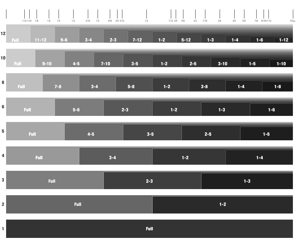
Cell Width Classes
Additional Cell Classes
By default, the right margin is applied to the cell so that they are spaced nicely on the page. Ordinarily, this means that a row of cells will have an extra right margin at the end.
This is resolved by adding the end class to the last cell. The end result is that all the cells are evenly distributed across the row with the last cell flush with the right of the parent container.
There will also be times when you do not want the default bottom margin. You can override the bottom margin by applying the flat class.
There is also the cell-right class, which causes the cell to float: right instead of float: left. Lastly there is the clear class, which applies clear: both to the cell, thus forcing a new row.
This diagram illustrates how the end, flat, cell-right and clear classes affect the layout. Consider ten cells (div containers), numbered 1-10, appearing sequentially in the HTML source:
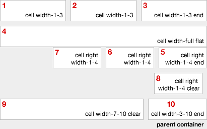
Cell Modifier Class Behavior
- Default cell (float left, right margin), 1/3 width
- Default cell (float left, right margin), 1/3 width. Notice how it is positioned to the right of the previous cell with a margin between.
- Default cell, 1/3 width with “end” class. Removing the right margin with the “end” class finishes the row and positions the cell flush right to the parent container.
- Default cell, full width with “flat” class. Note that full-width cells do not get the right margin, so no end class is required. The “flat” class removes the bottom margin, so the following cells are positioned flush to the bottom of this cell.
- Cell-right, 1/4 width with “end” class. Removing the right margin with the “end” class positions the cell flush right to the parent container. Also notice there is no margin between this cell and the cell above it because of the previous cell’s “flat” class.
- Cell-right, 1/4 width. Notice how it positions to the left of the previous cell with a right margin. Right-floated elements stack sequentially to the left of the previous right-floated element. Also notice it is flush to the bottom of the cell above it due to the “flat” class.
- Cell-right, 1/4 width. Notice how it positions to the left of the previous cell with a right margin. Also notice it is flush to the bottom of the cell above it due to the “flat” class.
- Cell-right, 1/4 width with “clear” class. Clearing the element positions it below any previous floated element, starting a new row. The default right margin positions the cell away from the right edge of the parent container and the previous cell’s default bottom margin positions the cell away from the cell above it.
- Basic cell, 7/10 width with “clear” class. Clearing the element positions it below any previous floated element, starting a new row and the previous cell’s default bottom margin positions the cell away from the cell above it.
- Basic cell, 3/10 width with “end” class. Notice how it is positioned to the right of the previous cell with a margin between. Removing the right margin with the “end” class finishes the row and positions the cell flush right to the parent container.
Appendix E: TIBERIUS Style Reference
In addition to the WordPress core and element-specific styles that are required for all themes, there are a number of custom styles that TIBERIUS uses to control theme-specific functionality, as well as helper styles that are included to make it easier to enhance your posts and pages. This is a list of the styles used by the TIBERIUS Theme Framework core:
| Cell Styles | These styles are automatically applied to Layout Items when selected in the Theme Options to control width and margins for fluid layouts. Cell styles can be manually applied to any elements (that support margin and width) to get the same behavior. Important: Cell styles contol much of the TIBERIUS Theme Framework functionality. Overriding the Cell styles is not recommended. |
.cell |
Block floated left with right and bottom margin. |
.cell-right |
Block floated right with right and bottom margin. |
.width-1-12, .width-1-10, .width-1-8, .width-1-6, .width-1-5, .width-1-4, .width-3-10, .width-1-3, .width-3-8, .width-2-5, .width-5-12, .width-7-16, .width-1-2, .width-9-16, .width-7-12, .width-3-5, .width-5-8, .width-2-3, .width-7-10, .width-3-4, .width-4-5, .width-5-6, .width-7-8, .width-9-10, .width-11-12, .width-full |
Sets width to corresonding percentage of parent container width accounting for default right margin. |
.end |
Sets right margin to zero. Intended to be applied to last cell in a row of cells. |
.flat |
Sets bottom margin to zero. |
.clear |
Applies clear:both to force a new row. |
| Additional Layout Styles | Apply these styles to containers for consistent spacing and position. They are intended for use as the values for the “Class” settings for Sections, Wrappers and Rows, but can be used on any element. |
.flush |
Modifies child elements to calculate actual width without right margin. |
.clearfix |
Clears floated child elements so container extends beyond outer height of children. |
.center-page |
Applies automatic left and right margin and sets max width to page-width (default is 1040px). |
.center-page-pad |
Applies automatic left and right margin, sets left and right padding to 20px and sets max width to page-width (default is 1000px + 40px of padding). |
.center-canvas |
Applies automatic left and right margin and sets max width to page-width (default is 1600px). |
.center-canvas-pad |
Applies automatic left and right margin, sets left and right padding to 20px and sets max width to canvas-width (default is 1560px + 40px of padding). |
.topbot |
Applies 20px top and bottom margins. |
.notopbot |
Sets top and bottom margin to zero. |
.top5, .top10, .top15, .top20, .top25, .top30, .top40, .top50, .top60 |
Applies fixed top margin. |
.bot5, .bot10, .bot15, .bot20, .bot25, .bot30, .bot40, .bot50, .bot60 |
Applies fixed bottom margin. |
.pad |
Applies 20px padding on all sides of element. |
.pad-lr |
Applies 20px padding to left and right sides of element. |
.pad-l |
Applies 20px padding to left side of element. |
.pad-r |
Applies 20px padding to right side of element. |
| Layout Helper Styles | These styles are intended to make individual content layouts easier. |
.abs |
Sets absolute position. |
.inset |
Applies 10px padding to all four sides of element. |
.infobox |
Sets display to block and applies 5px padding to all four sides of element. |
| Container Selectors | Used to identify specific regions of the layout |
#wrapper |
Selector for optional “main wrapper” when “wrap header with content” and/or “wrap footer with content” are selected. |
#header |
Selector for header section when “wrap section” is selected. |
#content-wrapper |
Selector for content (layout) section when “wrap section” is selected. |
#footer |
Selector for footer section when “wrap section” is selected. |
h1.site-title |
Selector for Site Title layout item. |
h2.site-tagline |
Selector for Site Tagline layout item. |
.header-image |
Selector for the actual image in Header Image layout item. Note: this is generated by WordPress. The id is configured in the Layout Item options panel. |
#tiberius_menu_header |
Selector for the dynamically generated Mobile Menu Panel header. |
#main_nav |
Selector for Menu Area layout item designated for use as the Mobile Menu Panel. Note: if more than one element has this id, the last element sequentially is selected. This is not a good practice because IDs should be unique to the document. |
.outer-header-container |
Selector for optional header row outer container. |
.outer-content-container |
Selector for optional content (layout) row outer container. |
.outer-footer-container |
Selector for optional footer row outer container. |
.inner-header-container |
Selector for header row inner container. All rows are rendered with the inner container. |
.inner-content-container |
Selector for content (layout) row inner container. All rows are rendered with the inner container. |
.inner-footer-container |
Selector for header row outer container. All rows are rendered with the inner container. |
.widget |
Selector for all widgets on the page. This class is included automatically in addition to any custom “Widget-before” classes that may exist. |
| Show/Hide Styles | Allows elements to be shown or hidden, either by setting the class dynamically or by the user’s device width. |
| Sets visibility to invisible but reserves the space it occupies. | |
.visible |
Sets the element’s visibility to visible. |
.none |
Sets the element’s display to none and collapses the space it occupies. |
.hide-desktop |
Hides elements on windows greater than the tablet breakpoint (default 980px). |
.show-desktop |
Shows elements on windows greater than the tablet breakpoint (default 980px). |
.hide-tablet |
Hides elements on windows smaller than or equal to the tablet breakpoint (defaults to 980px). |
.show-tablet |
Shows elements on windows smaller than or equal to the tablet breakpoint (defaults to 980px). |
.hide-handheld |
Hides elements on windows smaller than or equal to the handheld breakpoint (defaults to 600px). |
.show-handheld |
Shows elements on windows smaller than or equal to the handheld breakpoint (defaults to 600px). |
.hide-phone |
Hides elements on windows smaller than or equal to the phone breakpoint (defaults to 480px). |
.show-phone |
Shows elements on windows smaller than or equal to the phone breakpoint (defaults to 480px). |
.break-tablet |
Removes float from cells on windows smaller than or equal to the tablet breakpoint (defaults to 980px). Normally this does not occur unless smaller or equal to the handheld breakpoint (default 600px). |
.nobreak |
Keeps floating cells on windows smaller than or equal to the handheld breakpoint (defaults to 600px). Normally floats are removed for smaller devices, but this allows certain elements to keep columns intact. |
| Background, Border and Shadow | These styles are intended to keep backgrounds, borders and shadows consistent. |
.border |
Applies a one-pixel border around the element. |
.shadow |
Applies a soft, wide shadow around the element |
.raised |
Applies a slight shadow to the bottom of element, making it appear raised. |
.burned |
Applies a wide inset shadow to the element, simulating burned edges. |
.sunken |
Applies a slight inset shadow to the top and bottom of the element, simulating a channel effect. |
.gray |
Applies medium gray background (#ddd). |
.lightgray |
Applies light gray background (#f9f9f9). |
.white |
Applies a white background. |
.black |
Applies a black background. |
.shade-black-25 |
Applies a 25% transparent black background PNG image tile. |
.shade-black-40 |
Applies a 40% transparent black background PNG image tile. |
.shade |
Alias of .shade-black-40 |
.shade-black-70 |
Applies a 70% transparent black background PNG image tile. |
.shade-black-80 |
Applies a 80% transparent black background PNG image tile. |
.shade-white-50 |
Applies a 50% transparent white background PNG image tile. |
.tint |
Alias of .shade-white-50. |
.shade-white-80 |
Applies a 80% transparent white background PNG image tile. |
| Text Styles | Applies style to container text contents. |
.text-gray |
Sets text color to medium gray (#999). |
.text-lightgray |
Sets text color to light gray (#ddd). |
.text-white |
Sets text color to white. |
.text-black |
Sets text color to black. |
.required |
Sets text color to red. |
.larger |
Sets text size to 1.4em (40% larger). |
.smaller |
Sets text size to 0.8em (20% smaller). |
.center |
Sets text alignment to center. |
.right |
Sets text alignment to right. |
.left |
Sets text alignment to left. |
| Nav Menu Styles | Controls behavior of navigation menus. Use these styles as the values for the “Menu Class” setting in the Menu Area control panel. |
.horz-menu |
Makes Menu Area behave as a Horizontal Menu. Intended to be entered as value for the Class setting in the Menu Area settings panel. |
.context-menu |
Makes Menu Area behave as a Contextual Menu. Intended to be entered as value for the Class setting in the Menu Area settings panel. |
.inline-menu |
Makes Menu Area behave as an Inline Menu. Intended to be entered as value for the Class setting in the Menu Area settings panel. |
.panel-push |
Sets Mobile Menu Panel Push Effect animation. Intended to be entered as value for the Class setting in the Menu Area settings panel. |
.panel-overlay |
Sets Mobile Menu Panel Overlay Effect animation. Intended to be entered as value for the Class setting in the Menu Area settings panel. |
.panel-reveal |
Sets Mobile Menu Panel Reveal Effect animation. Intended to be entered as value for the Class setting in the Menu Area settings panel. |
.origin-top |
Sets Mobile Menu Panel animation origin to “top.” Intended to be entered as value for the Class setting in the Menu Area settings panel. This option is only available for the Overlay Effect animation. |
.origin-left |
Sets Mobile Menu Panel animation origin to “left.” Intended to be entered as value for the Class setting in the Menu Area settings panel. |
.origin-right |
Sets Mobile Menu Panel animation origin to “right.” Intended to be entered as value for the Class setting in the Menu Area settings panel. |
Need More Help?
Contact us to provide feedback or if you have questions about the TIBERIUS Theme Framework.